.svg)
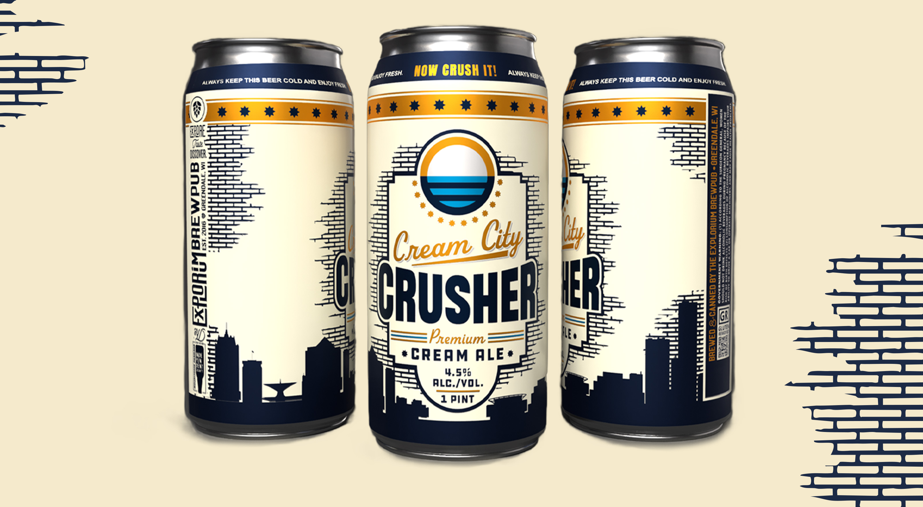
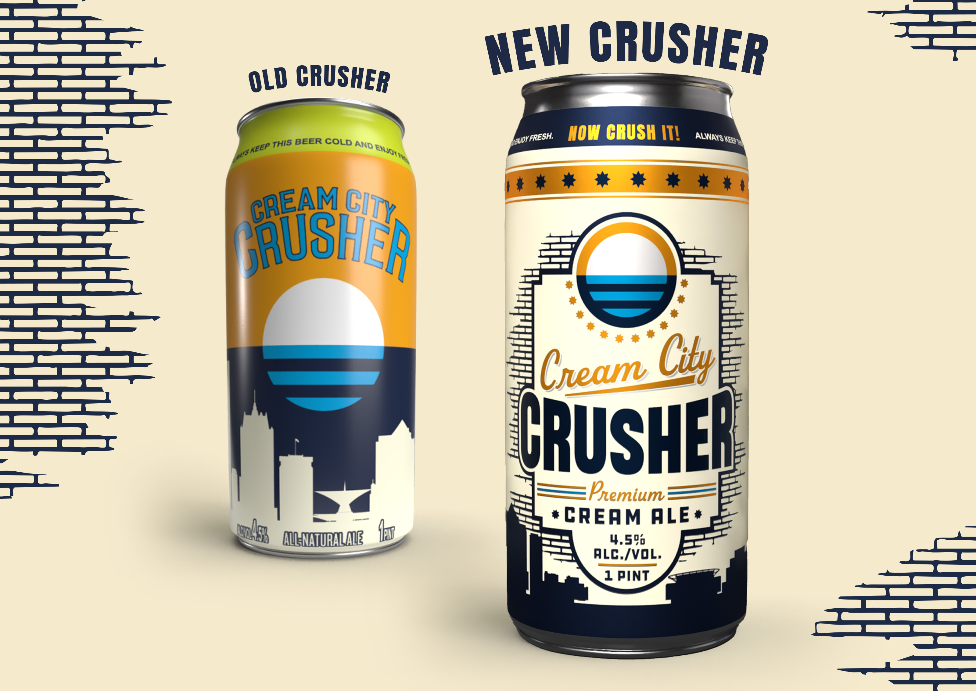
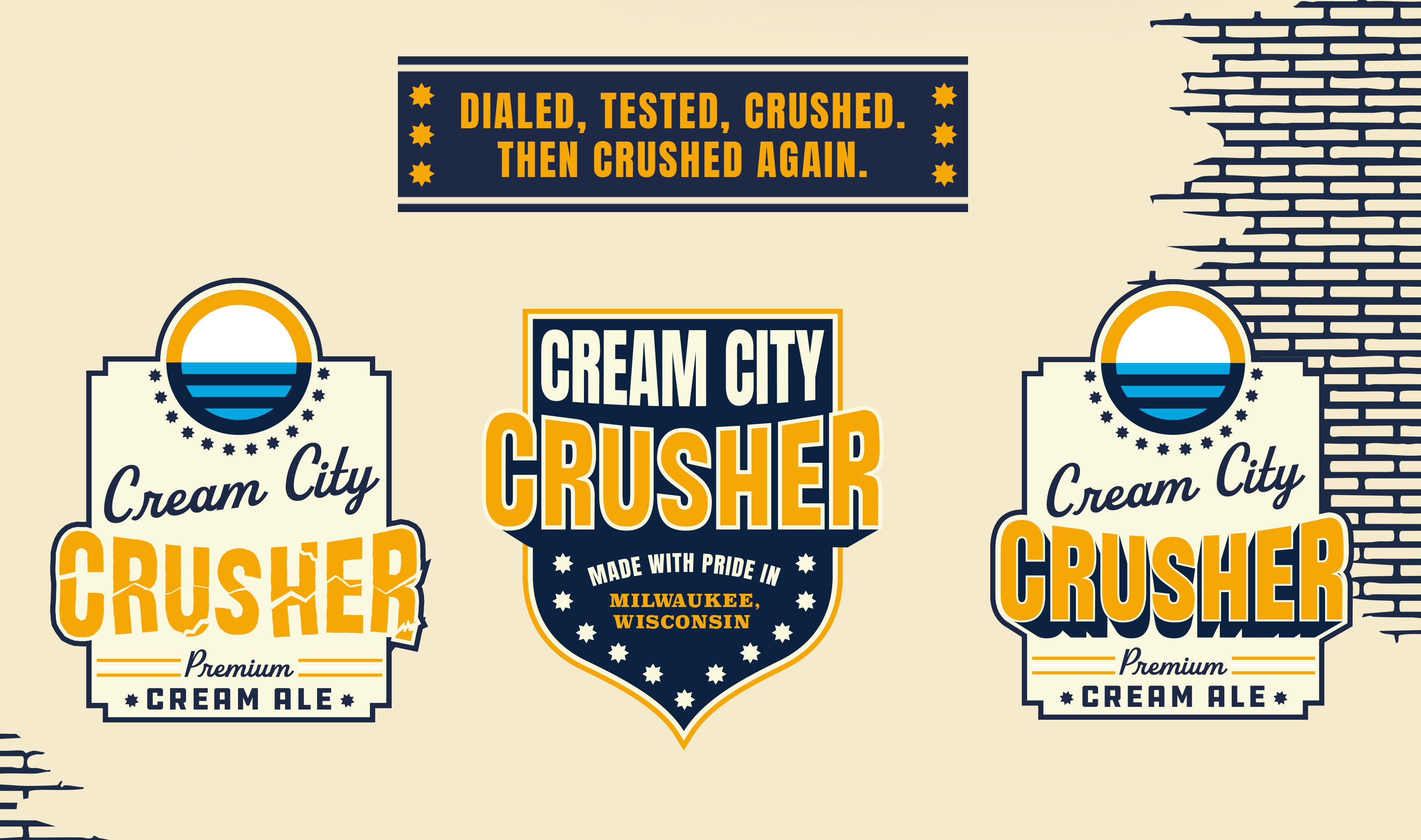
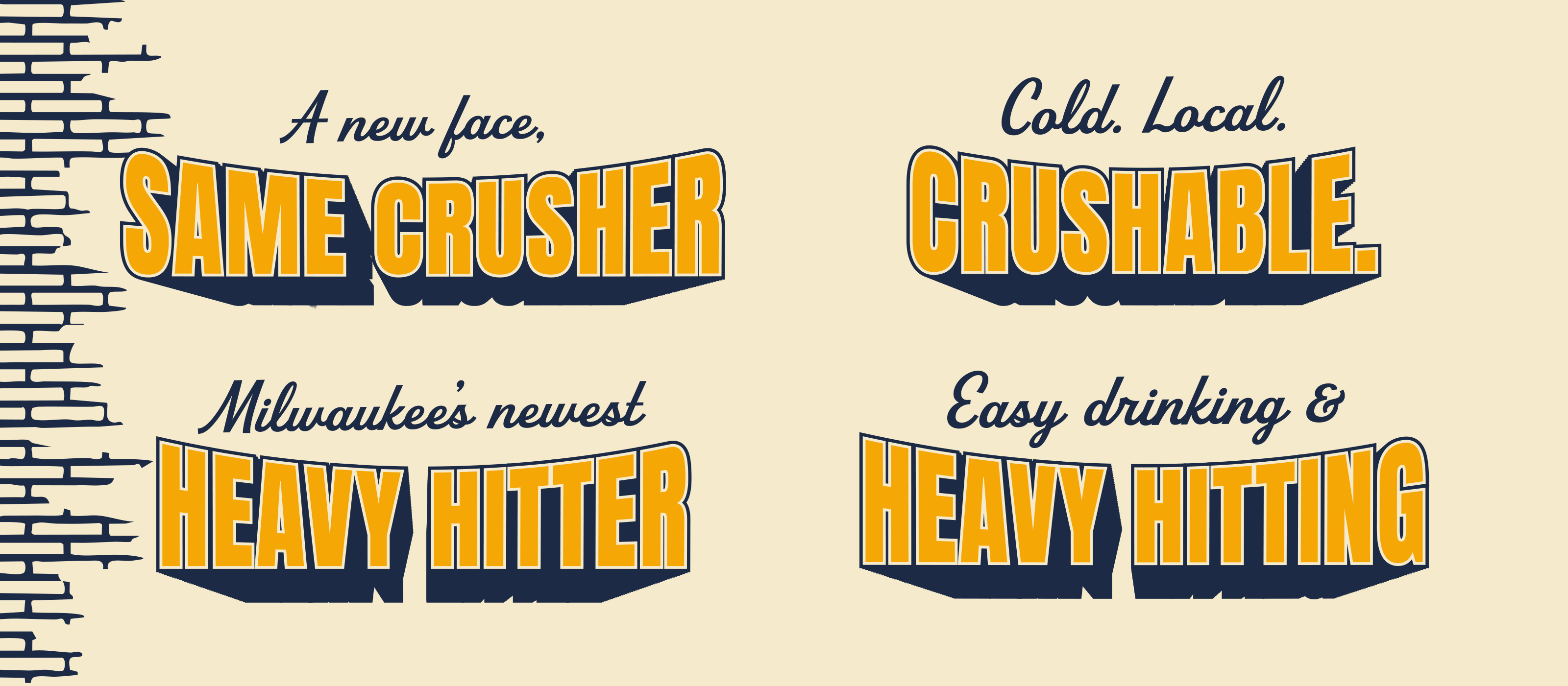
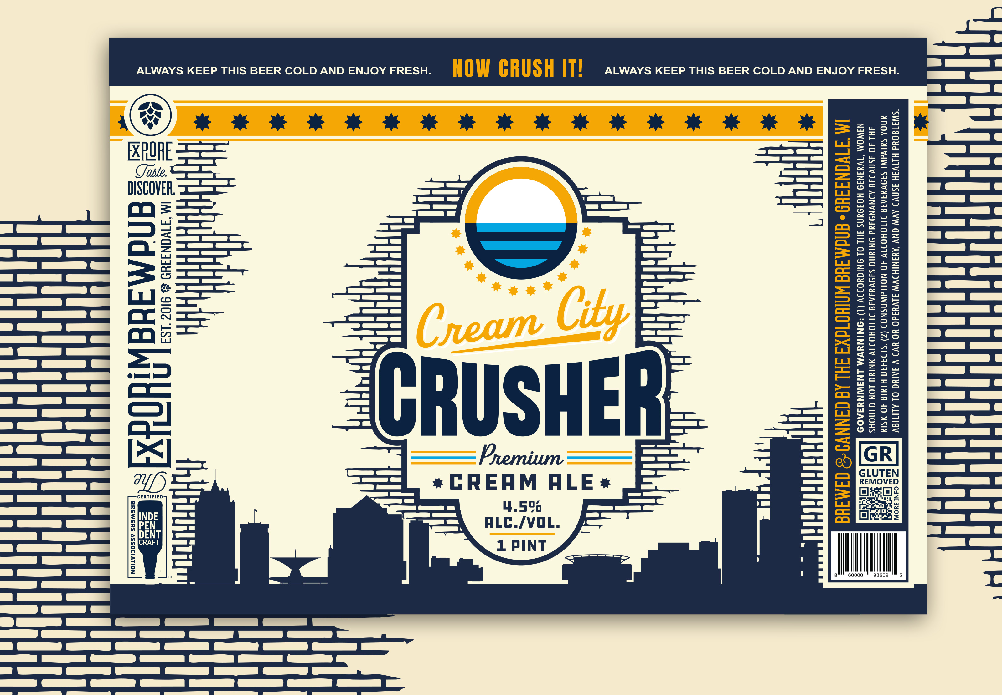
Cream City Crusher was built to feel like Milwaukee in a can. Rawson Studio took one of Explorium’s flagship beers and gave it a refreshed identity rooted in cream city brick, old-school wrestling, and blue-collar Milwaukee grit. The name itself pulls from both Milwaukee’s “Cream City” nickname and the legendary wrestler The Crusher, creating a can that feels loud, proud, and impossible to ignore. The goal was not to create another clean, forgettable cream ale label. It was to make something that felt like a beer version of Milwaukee itself: tough, local, a little rough around the edges, and built to stand out.
The refreshed label leans into bold type, cream city brick textures, metallic details, and a more aggressive visual system that gives the beer stronger shelf presence and more ownability. It takes inspiration from classic wrestling posters, old Milwaukee signage, and the larger-than-life energy of The Crusher himself. The result is a can that feels like it could have been ripped straight from a wrestling flyer hanging in the window of a neighborhood tavern, while still feeling polished enough to hold its own in retail coolers and grocery aisles. It gives Explorium a hero beer with a hero identity to match.