.svg)
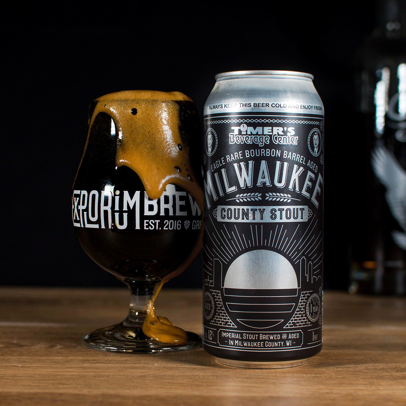
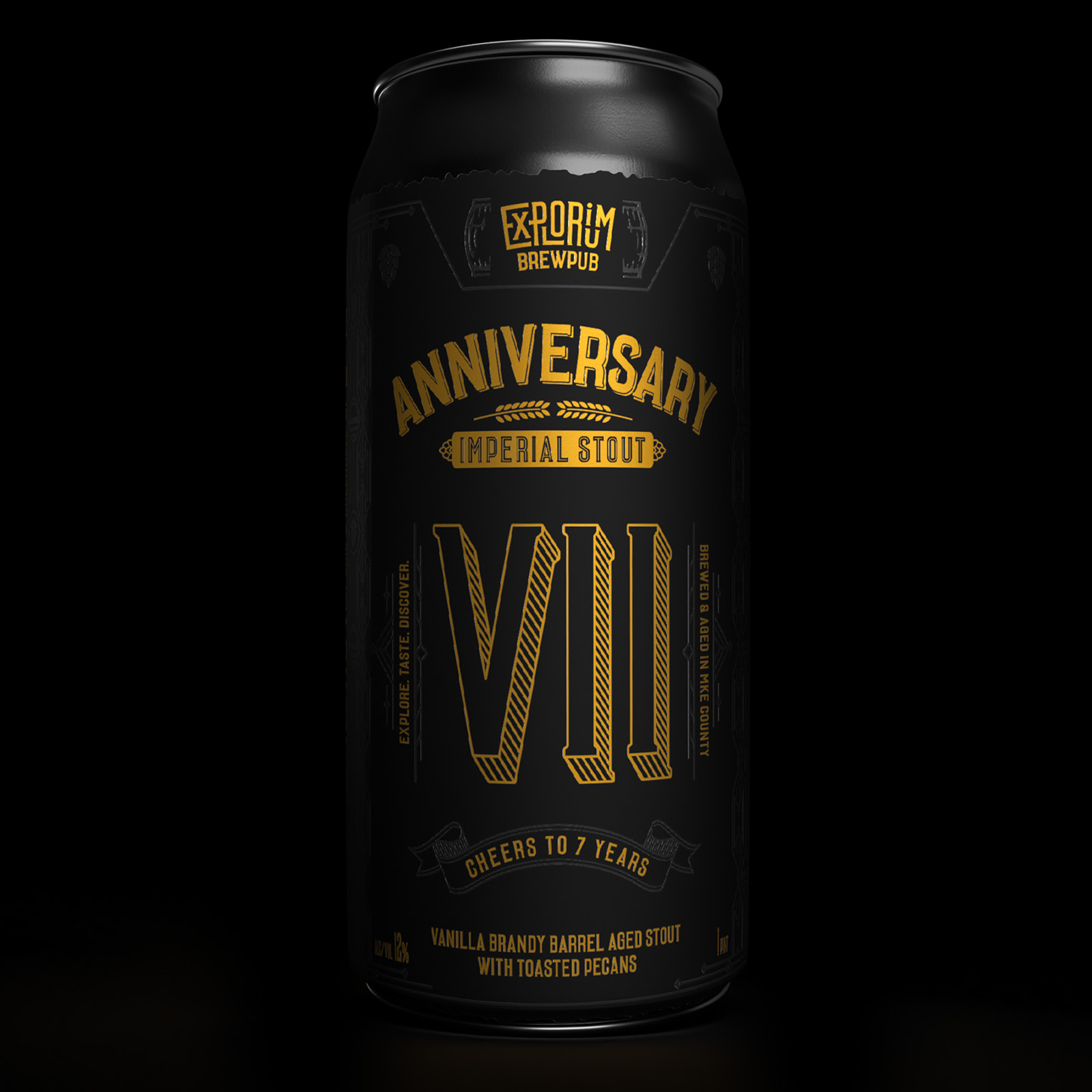
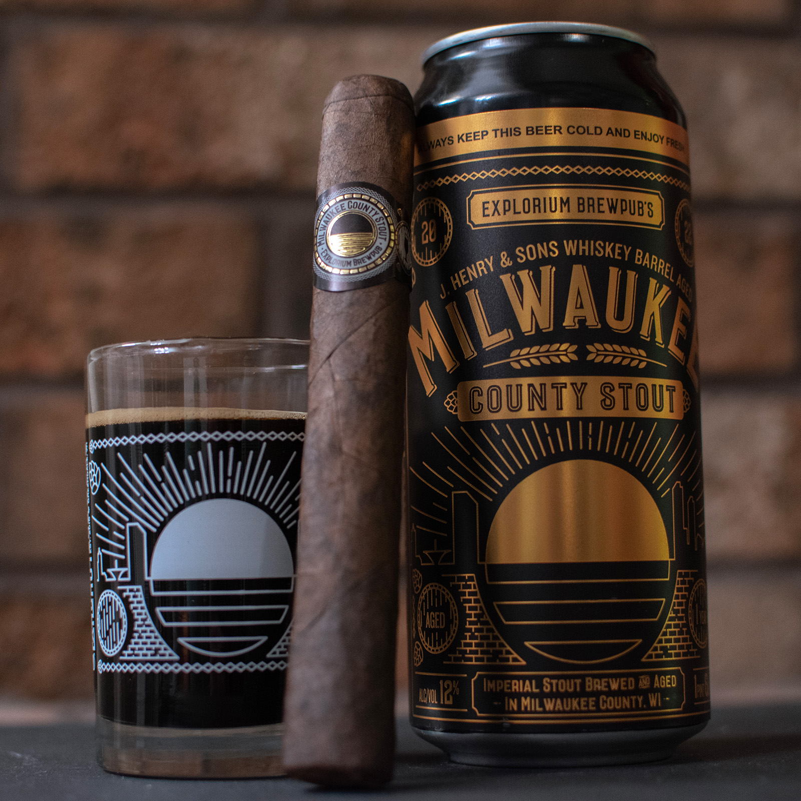
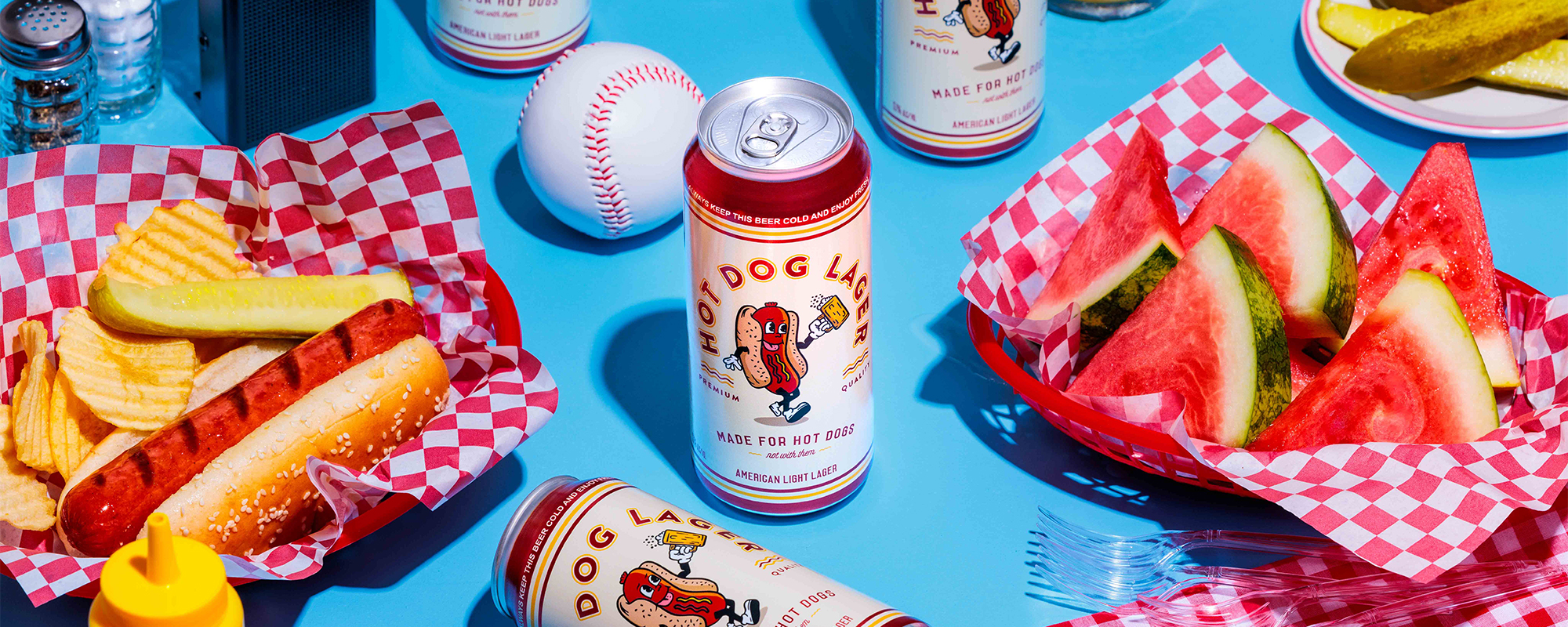
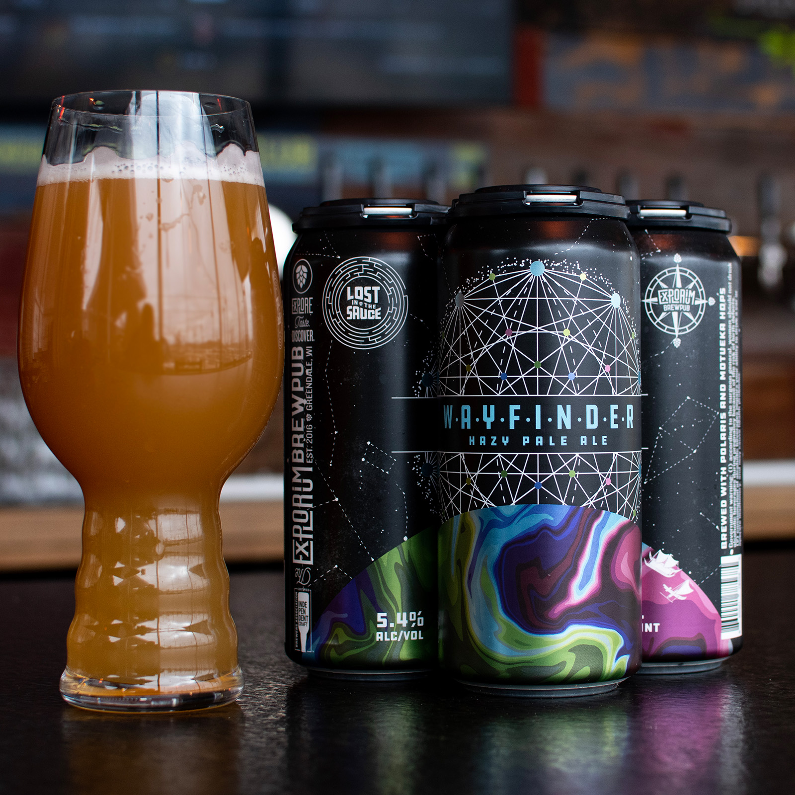
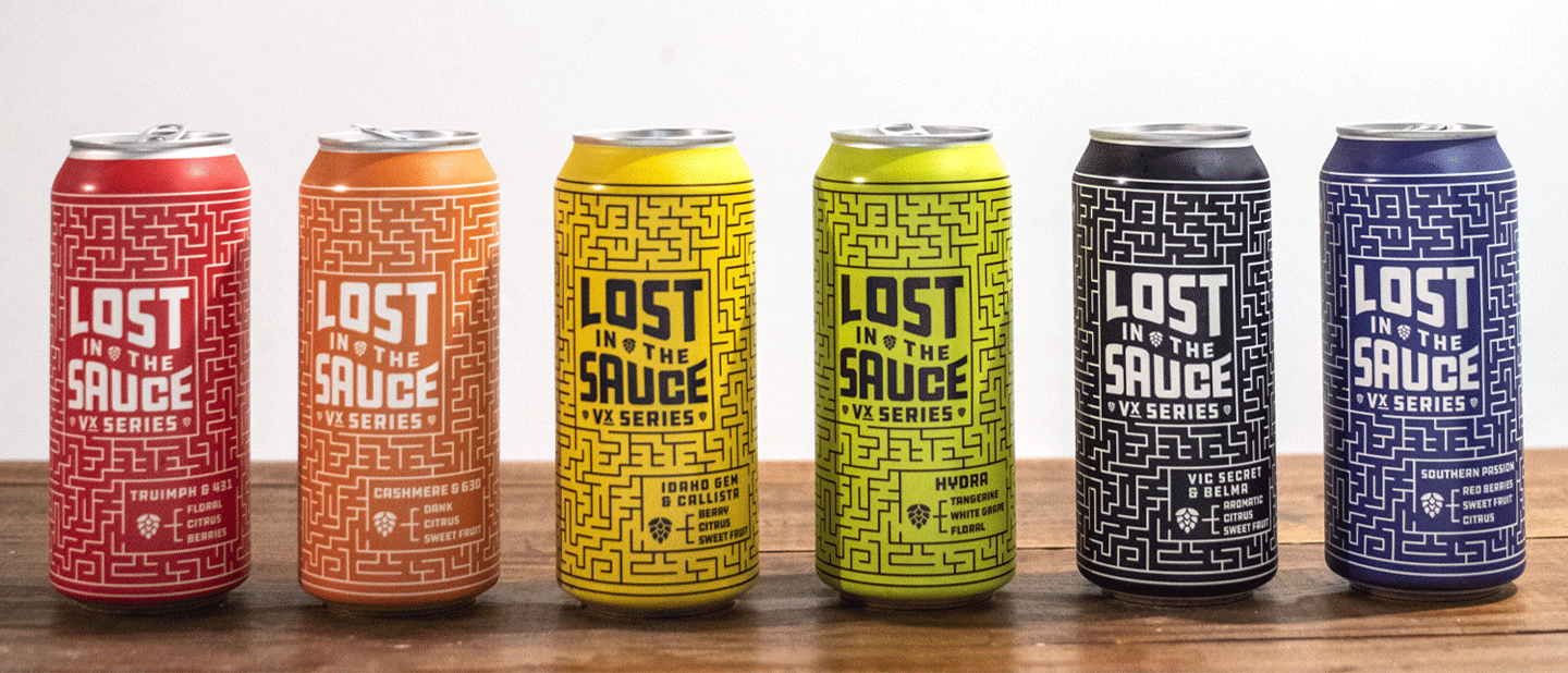
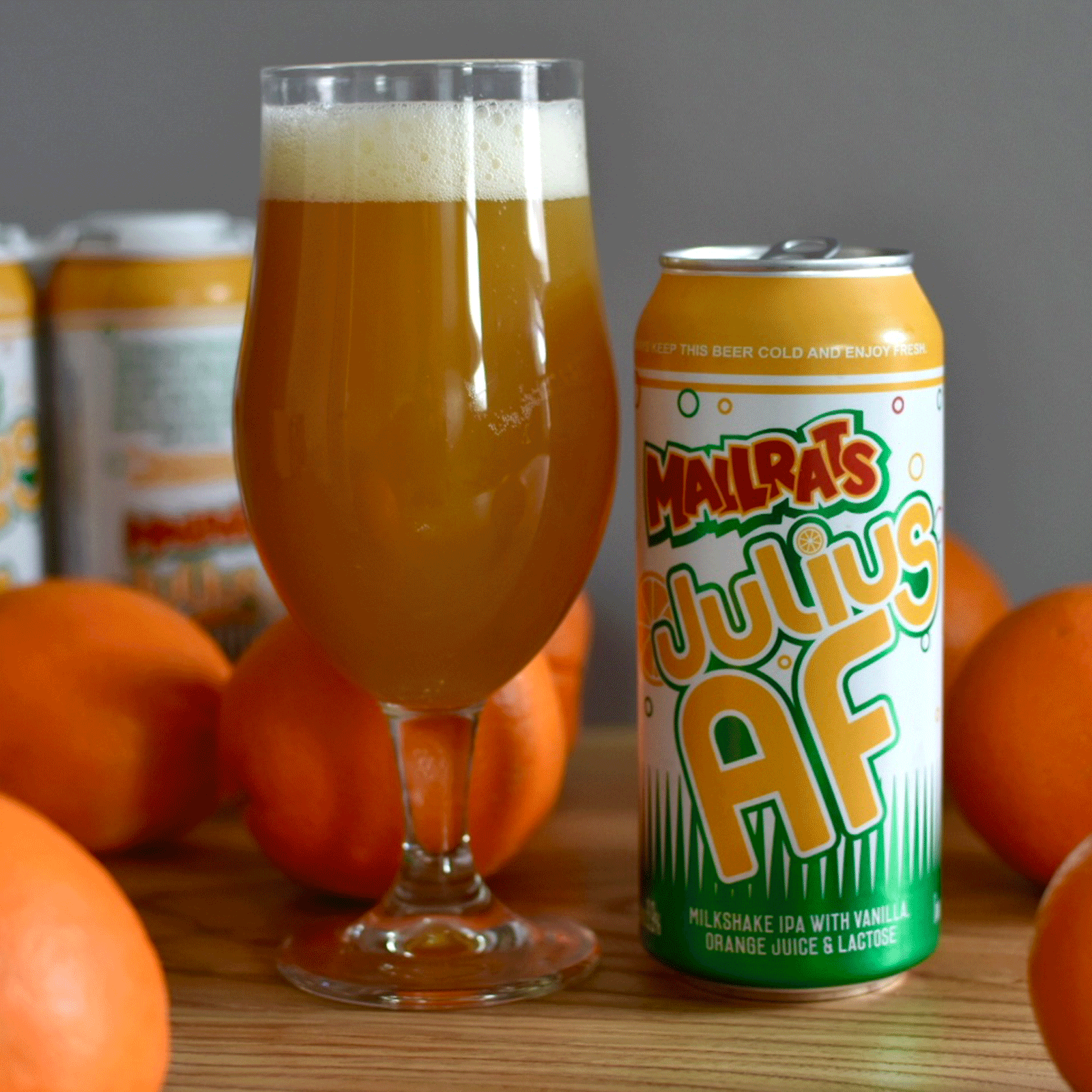
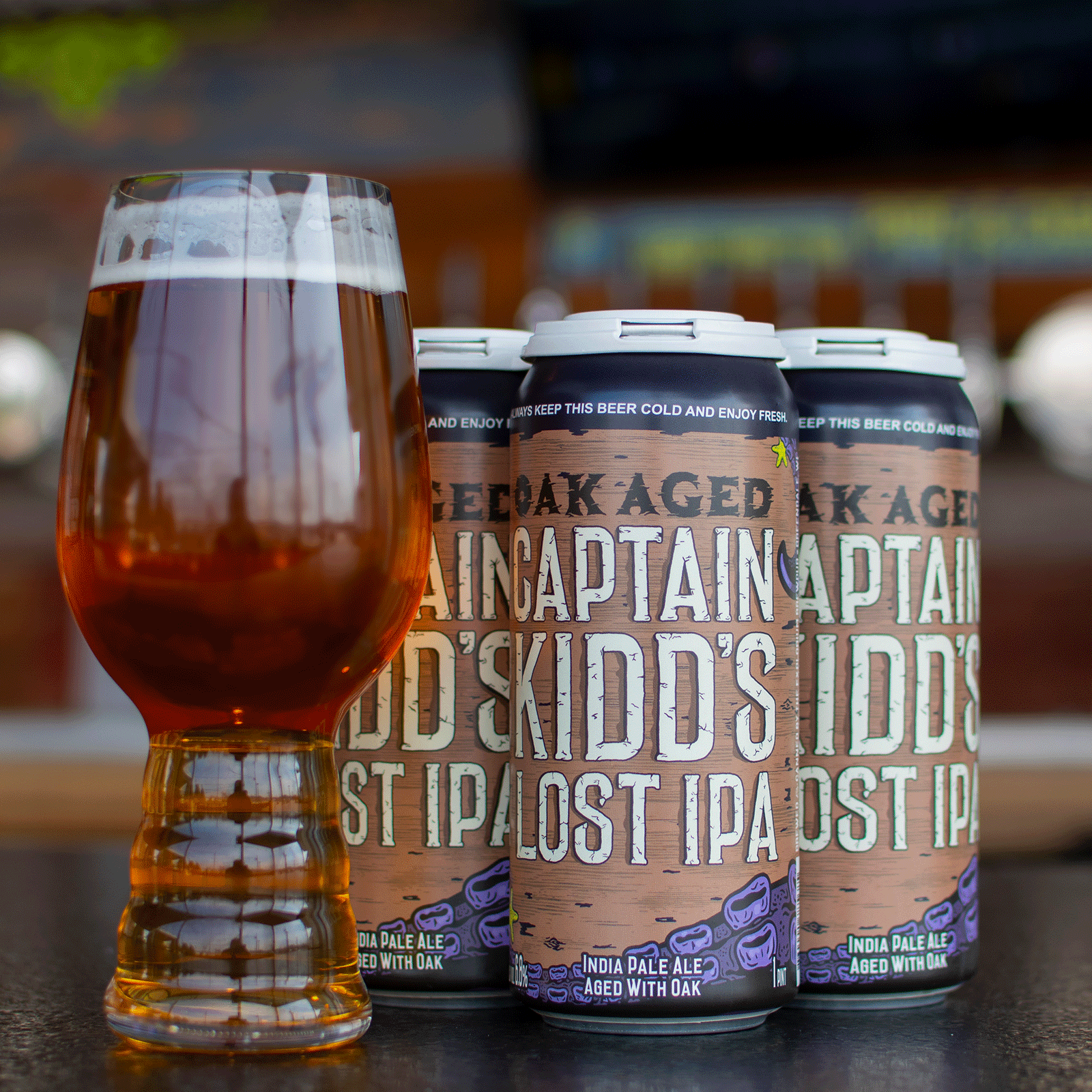
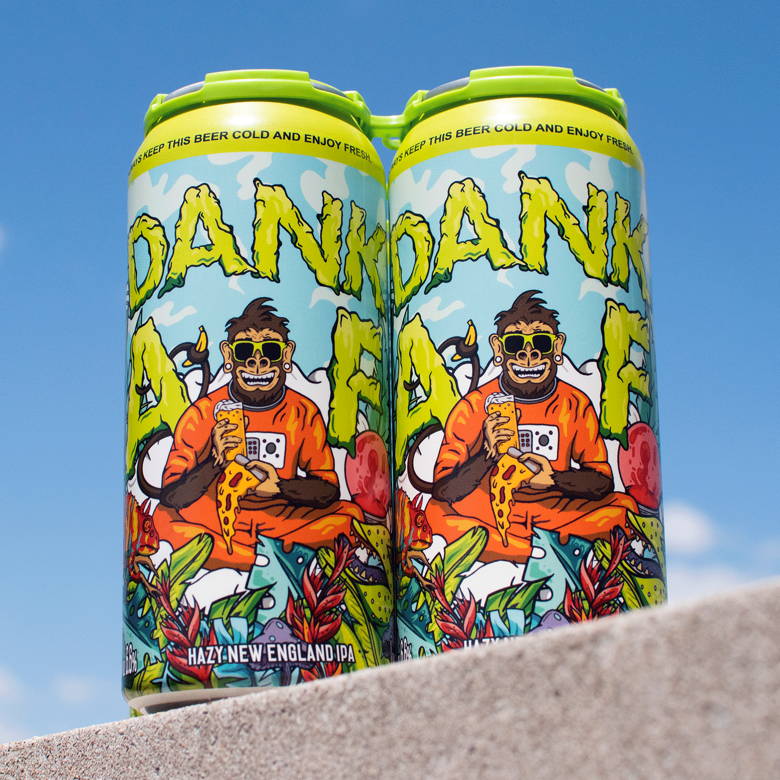
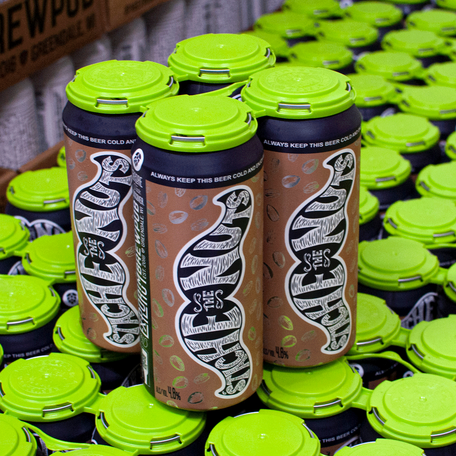
For more than 150 labels and counting, Rawson Studio has partnered with Explorium to create beer packaging that feels less like a standard can design and more like a collectible piece of art. Every label starts with the beer itself, then expands into a full world of illustration, typography, storytelling, and personality. Some labels lean loud, weird, and over-the-top. Others feel cleaner, more classic, or more rooted in typography. One beer might look like a punk rock poster, another like a retro travel postcard, a wrestling flyer, or a vintage food package. The common thread is that every can is built to stop people in their tracks, create curiosity, and make them want to crack it open.
The result is a label system that gives Explorium a huge advantage on the shelf and in the cooler. These are not just beer labels. They are stories people remember, products people talk about, and cans people want to collect long after the beer is gone. From hot dog lagers and dessert stouts to hard seltzers and seasonal one-offs, the work helps Explorium feel fresh, unpredictable, and impossible to ignore. It keeps customers coming back to see what madness hits the shelves next.